Festival Design
Target Audience
This festival’s target demographic specifically focuses on young adults, women, and families who can afford to buy or make costumes and purchase items from shops. The target psychographic is those who are interested in the Regency era, period dramas, period novels, and dressing up to attend the festival and participate in some of the other events.


Creating a Moodboard

When designing a poster and visual identity for this festival, it was important to refrence simple and elegant designs that would evoke feelings of romance, longing and grace, which are associated with the Regency era. It was also important use a low-saturation colour palette that would suit the festival theme.
Type Exploration
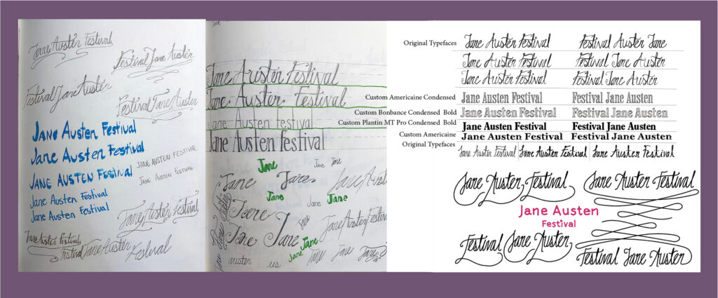
Initally experementation with handwritten cursive lettering was done to connect the festoval to it’s theme of elegance and the Regency era. Different ways that serif type could be used was also experemented with using imagry of florals eating away at the type. In the end a hand-drawn embroidery was created to ensure easy readability and connect to the tradition of practicing embroidery, which was common during that time period.
Sketches and Poster Variations
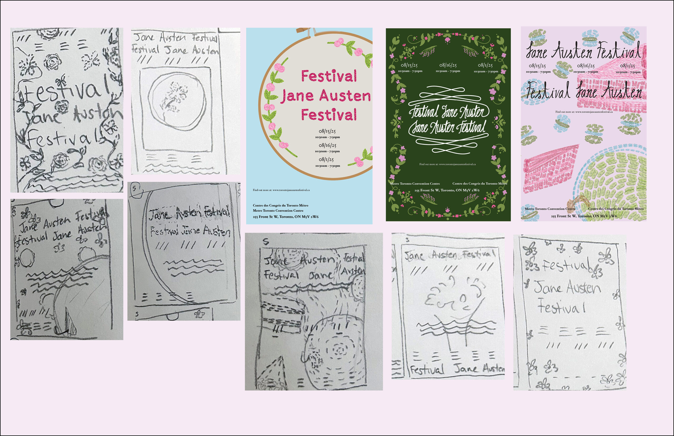
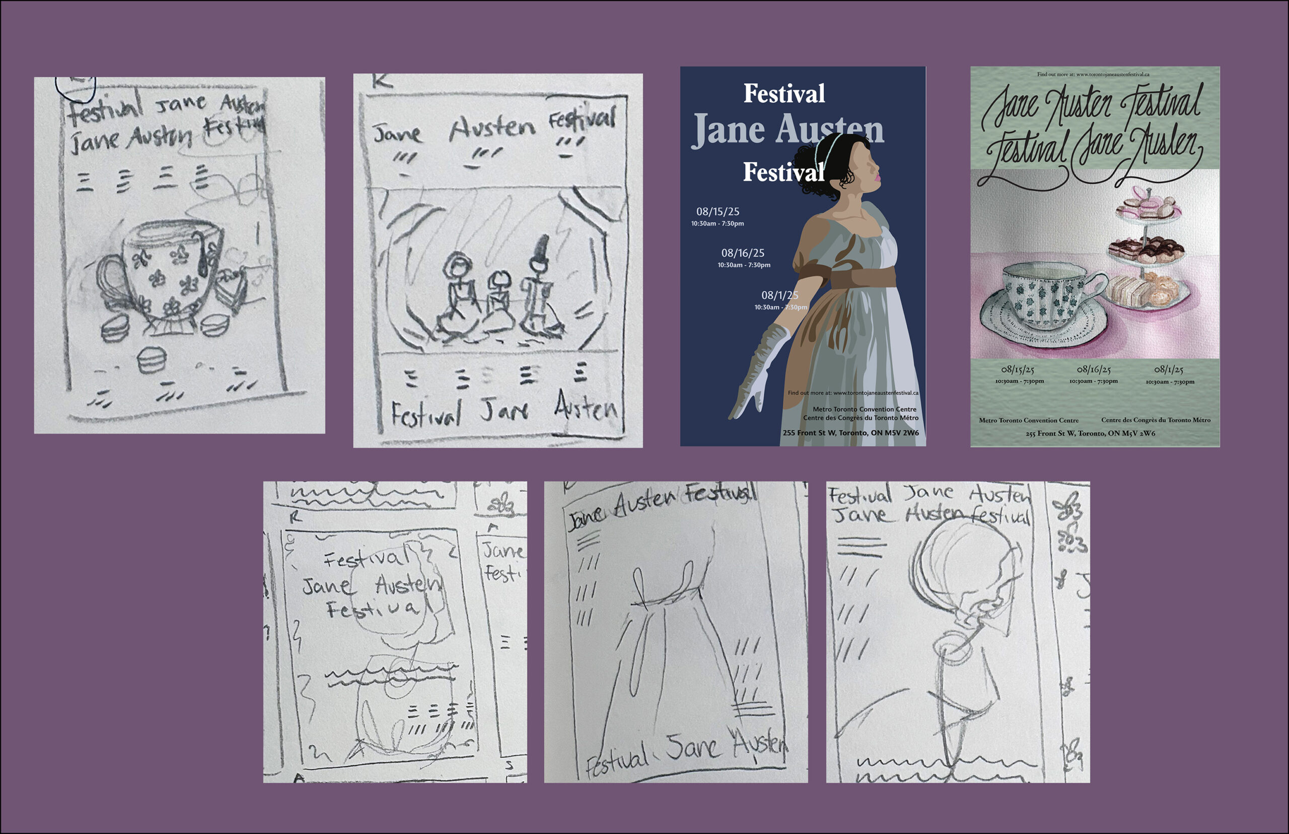
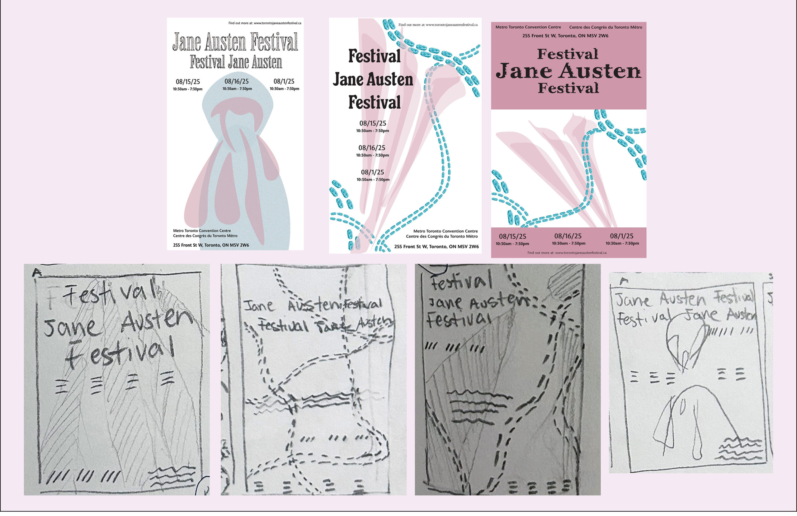
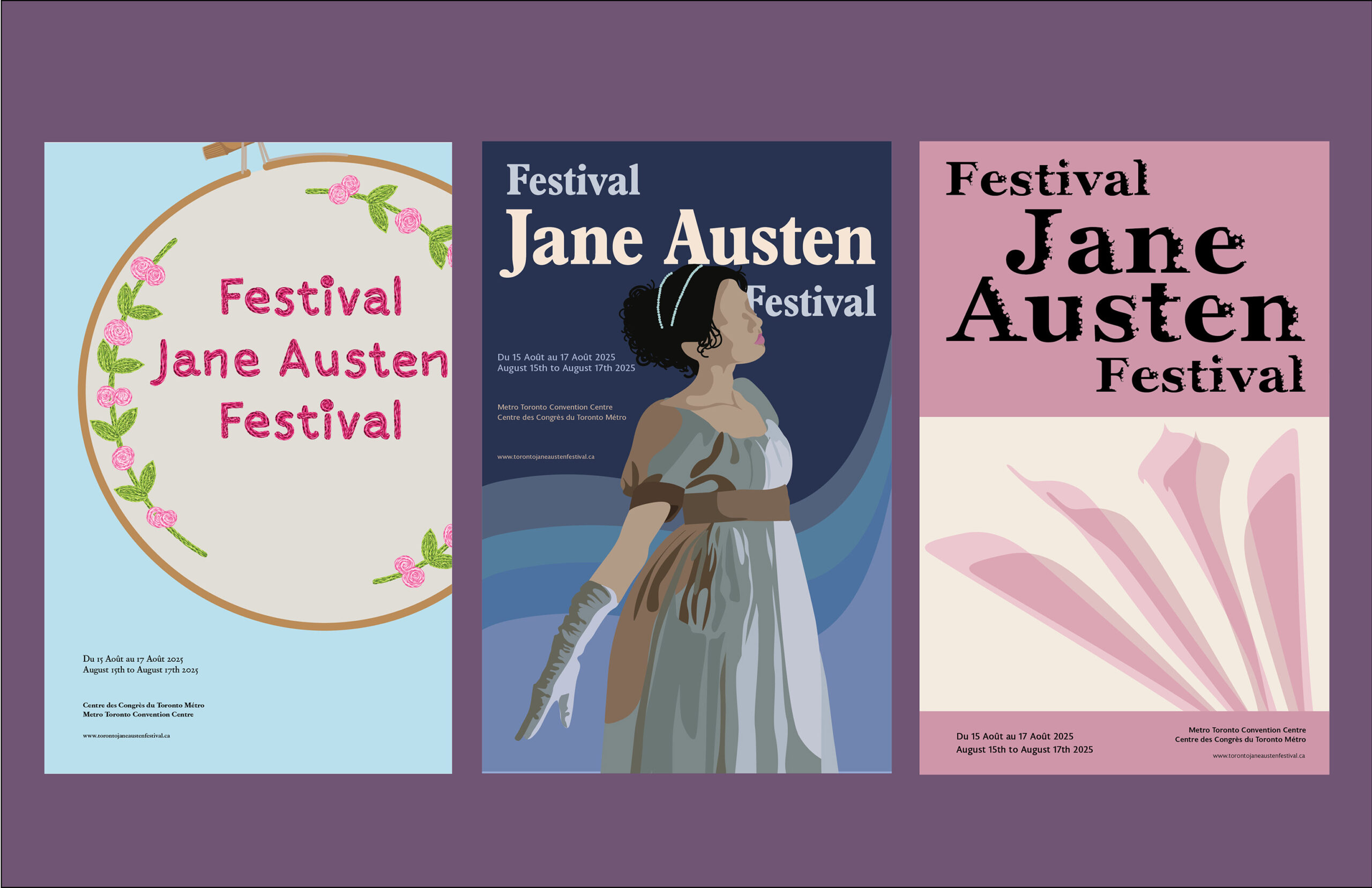
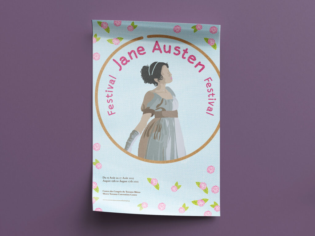
The final poster is a combination of two, featuring a Regency era woman embroidered on a hoop. This allows viewers to see themselves in the poster and connect with it, and it also tells them what the theme is without them needing to read anything. The elements featured in the final poster would end up being the style used for the tickets, press passes, brochures and splash pages, so the design must feature elements that would look appealing and effective in any format.
Tickets and Press Passes
Splash Pages
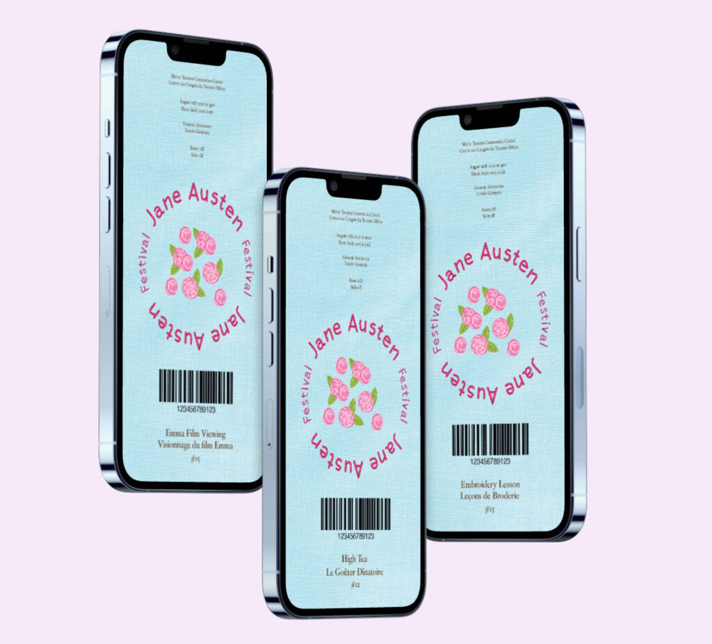
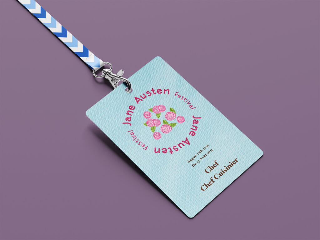
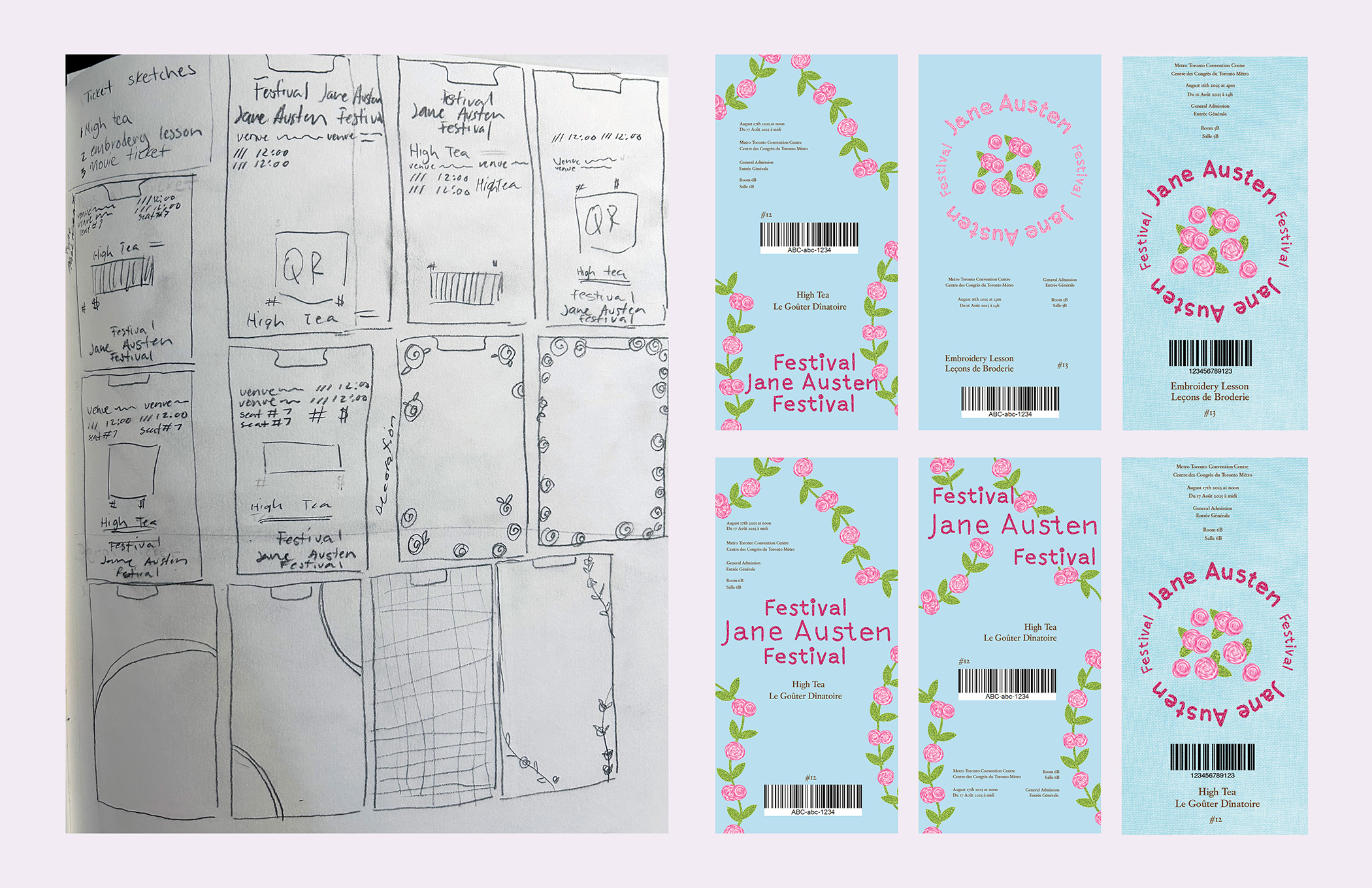
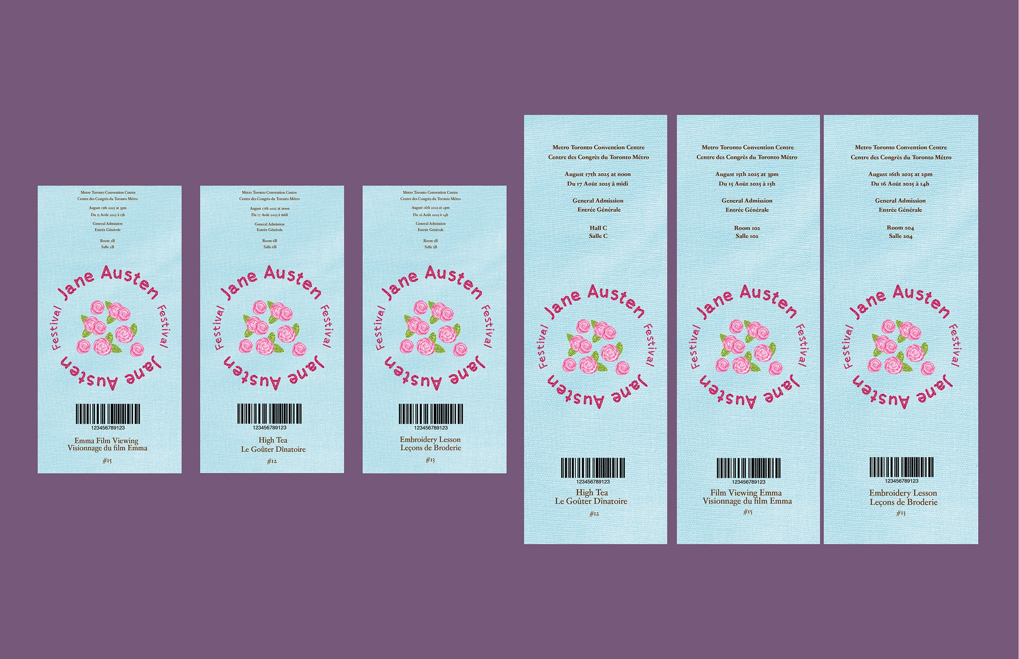
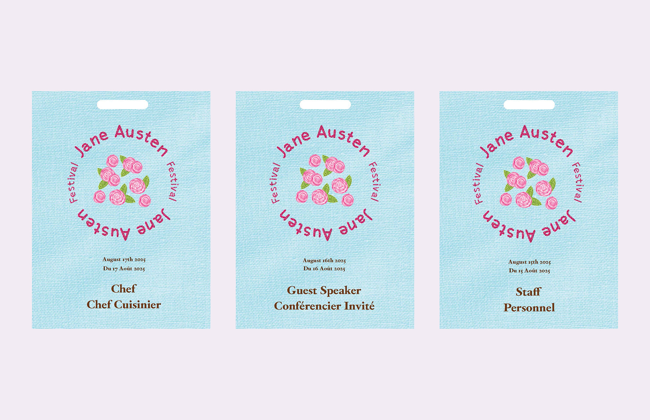
The tickets and press passes feature a simplified version of the poster, placing the type in a circle that reflects the embroidery hoop and can be read in both English and French. The physical tickets are designed to work as a bookmark, which pairs well with the brochure booklet.
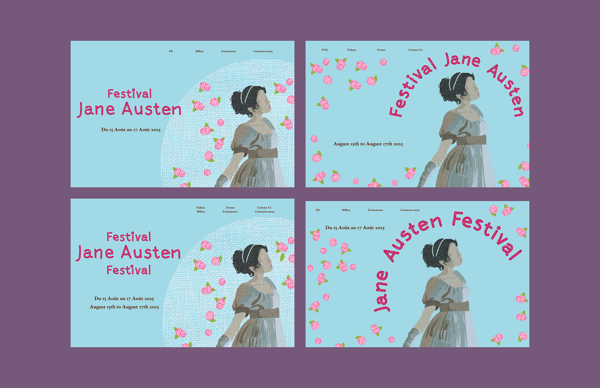
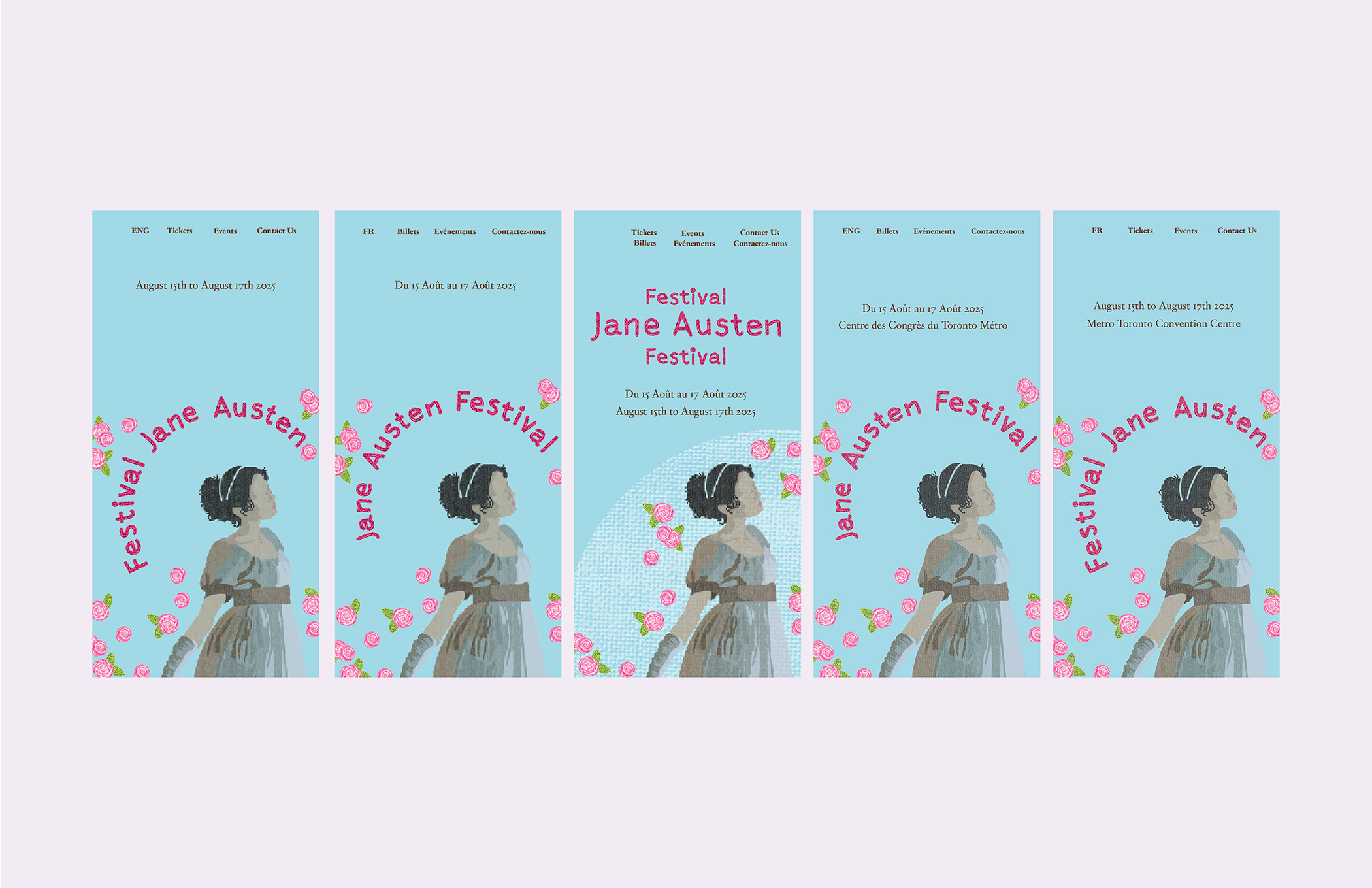
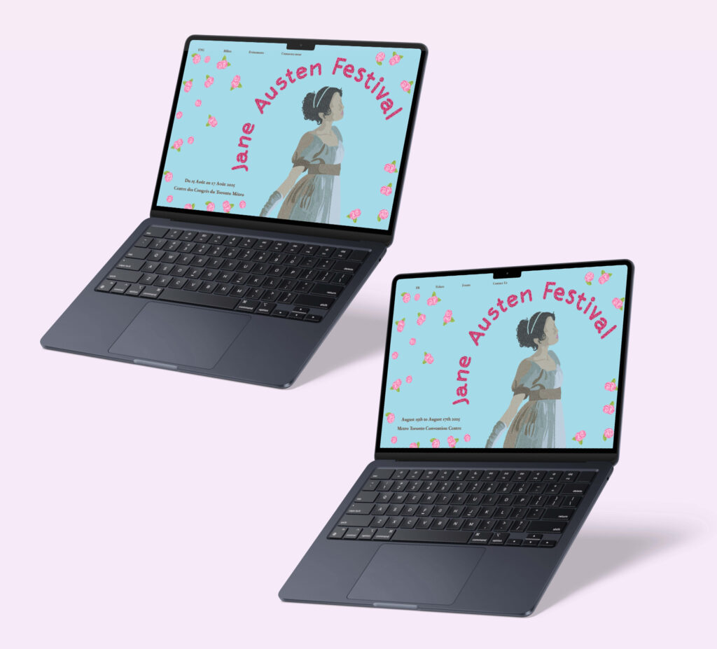
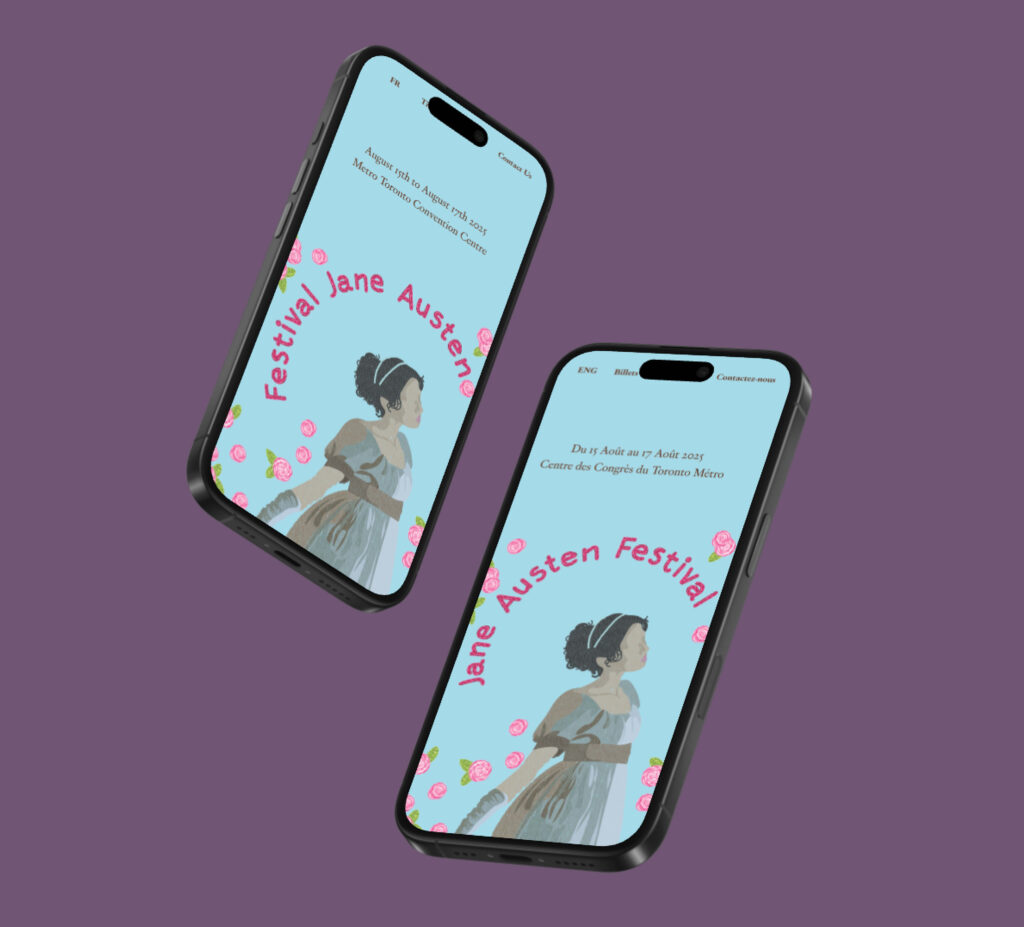
The splash page incorporates all elements of the poster but also ensures that it matches the tickets as well. It features a button that allows viewers to choose between an English and a French site.
Brochure
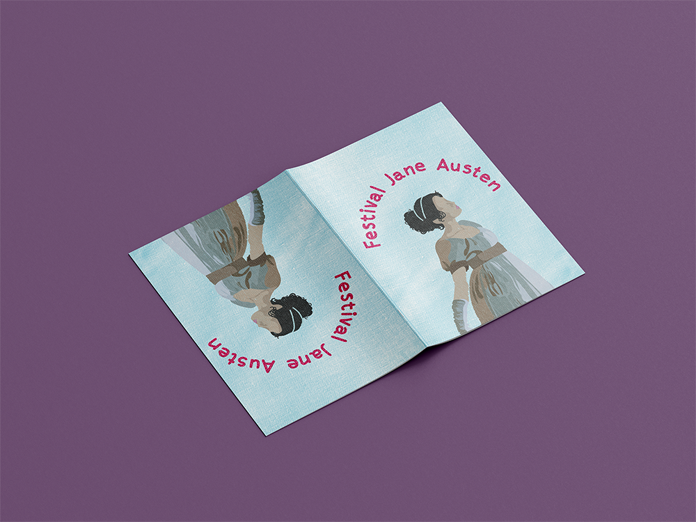
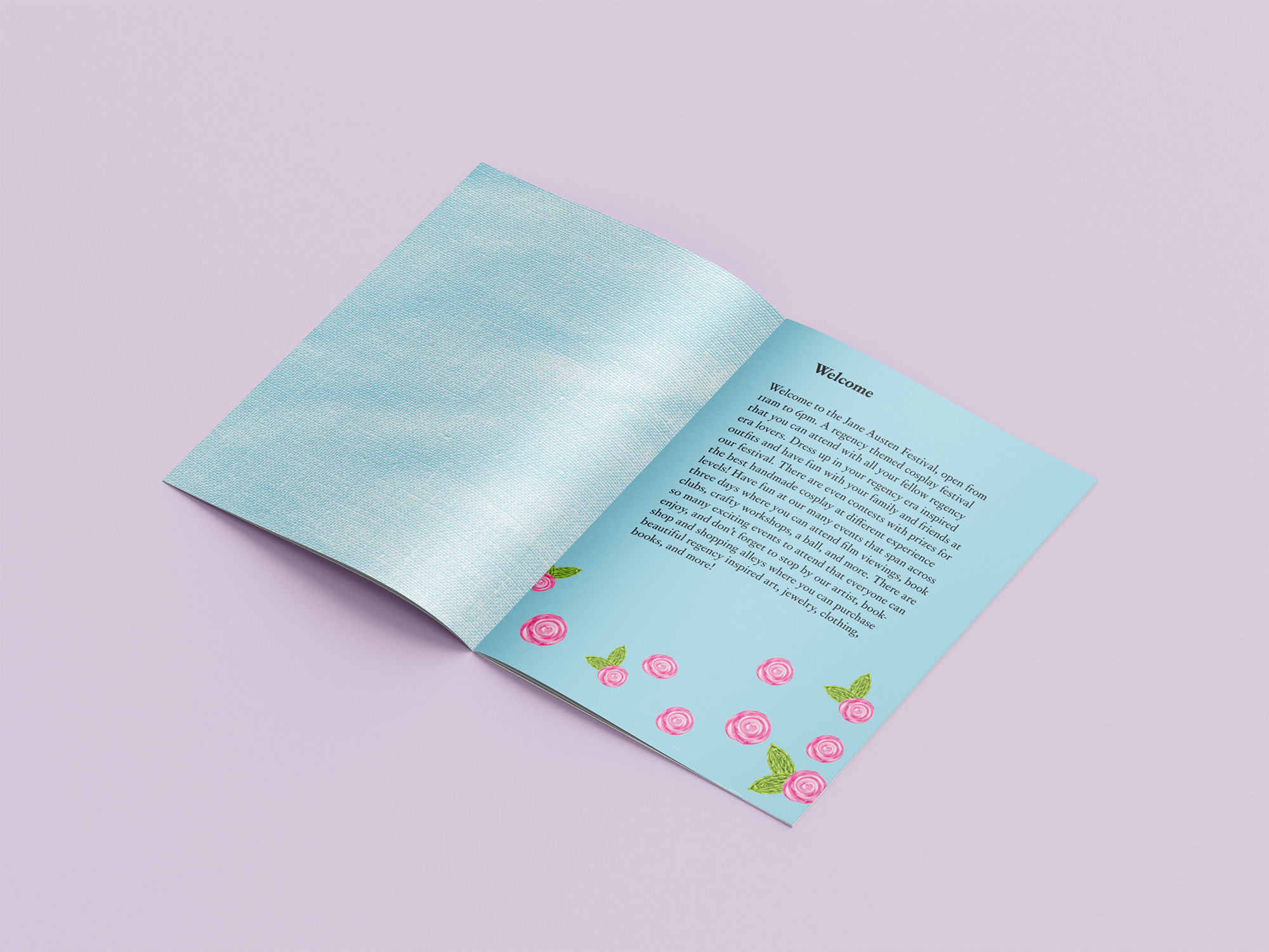
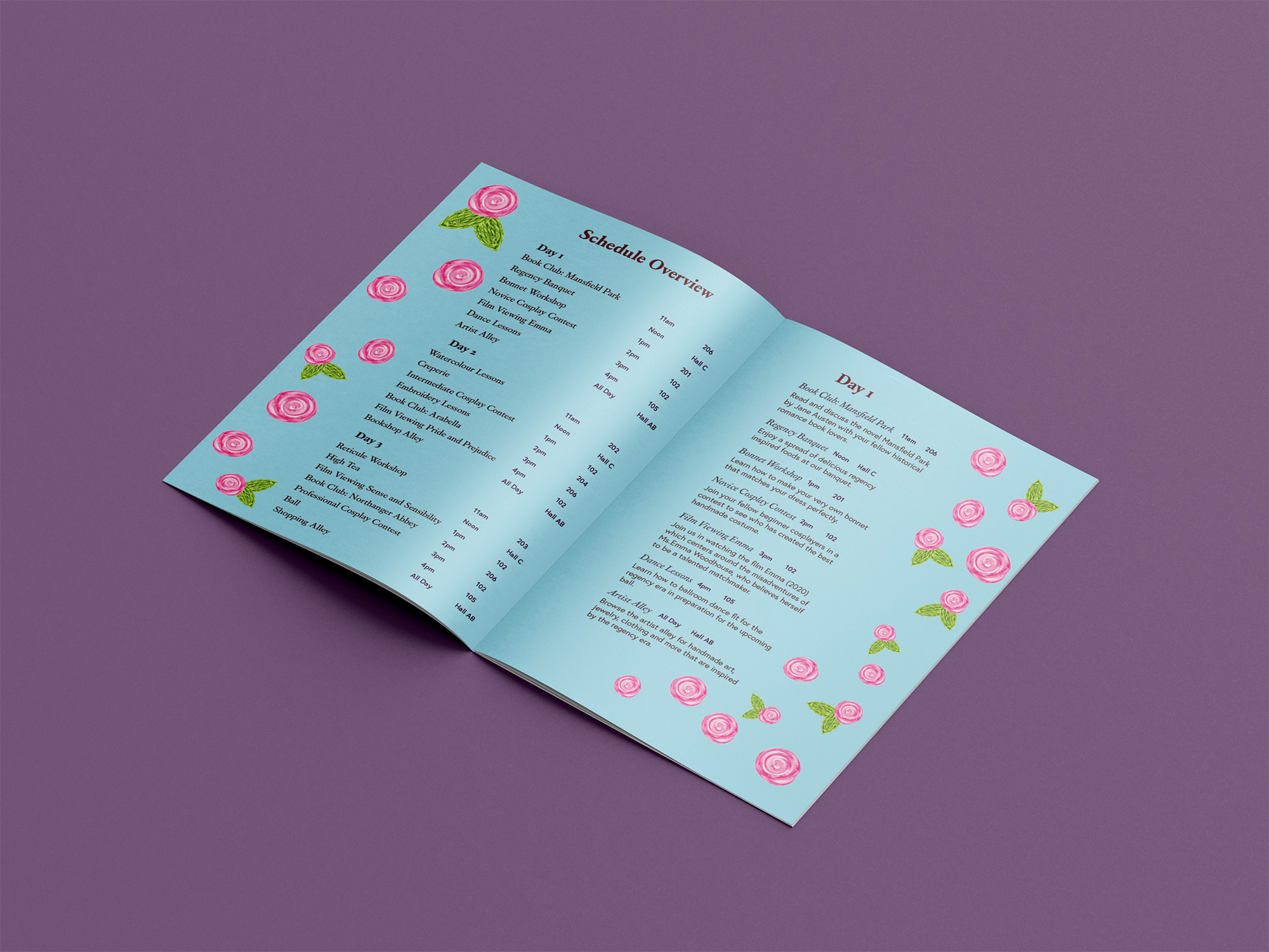
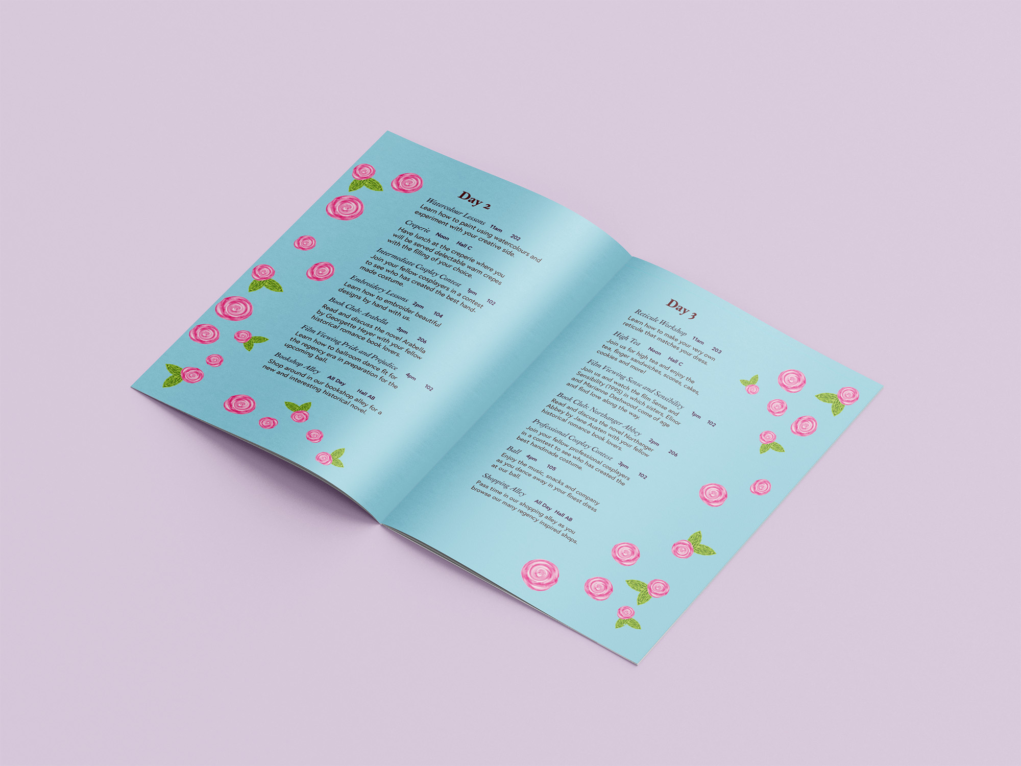
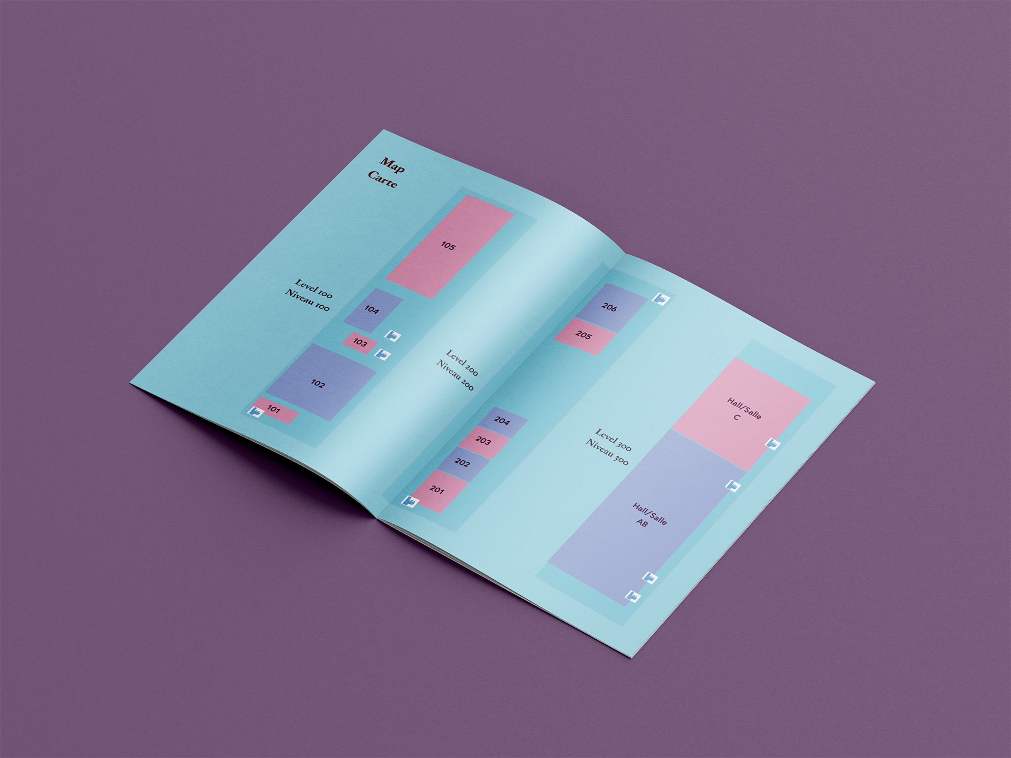
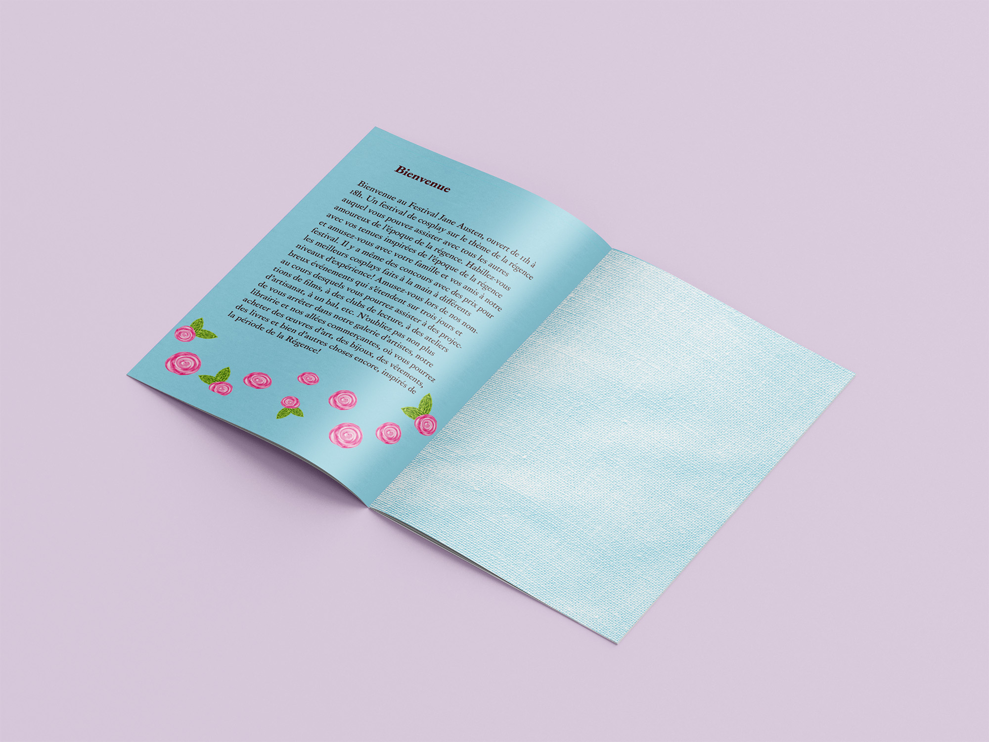
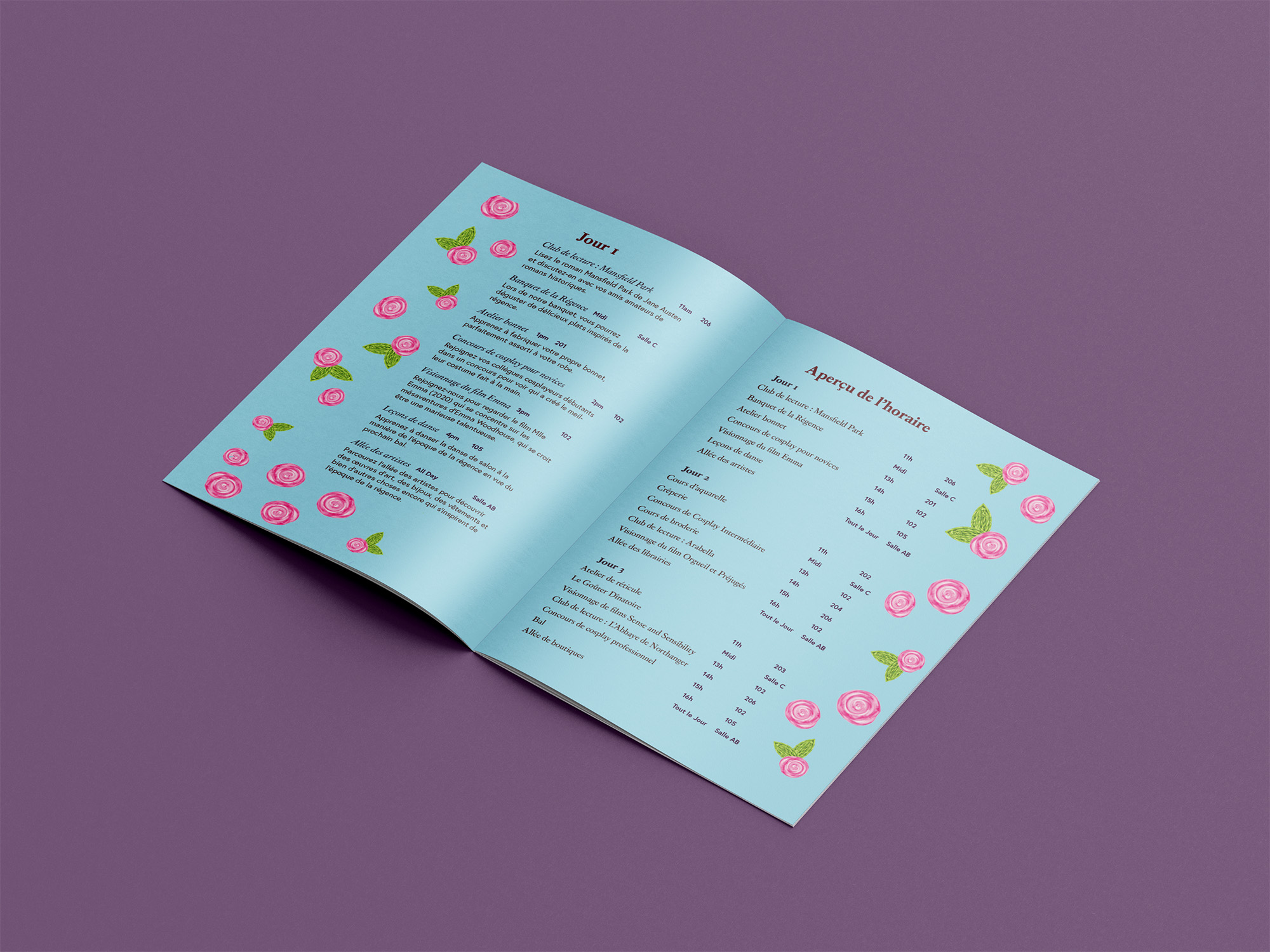
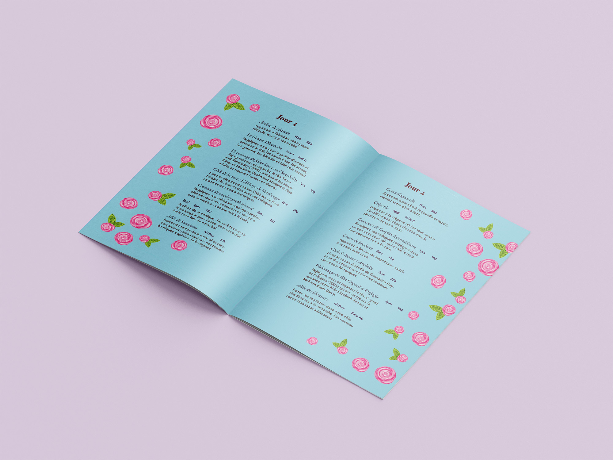
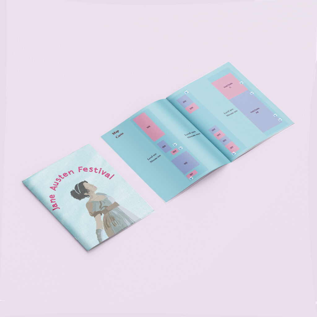
The brochure is designed as a booklet that would work well with the bookmark/physical tickets. The brochure is bilingual, and halfway through, where the map is located, it needs to be flipped to read the French side (starting from the back of the booklet). This choice allowed for the French and English to be equal and have their own “start points” depending on which side the reader starts from.