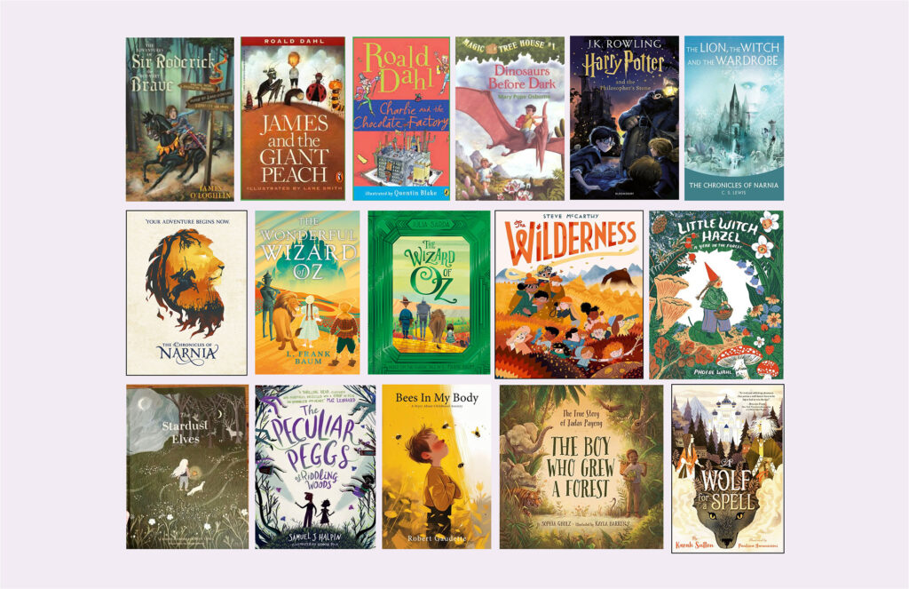
The Chronicles of Narnia

This book cover was designed to appeal more to children and young adult readers. The illustration is simple, and the children are illustrated to look less realistic and more characterized. The colour palette is bright while still being realistic to the scene it represents; it is meant to look mystical at the same time. This cover also features a custom type that I created based on the film’s typeface for ‘Narnia’ with added embellishments that make it look more magical.

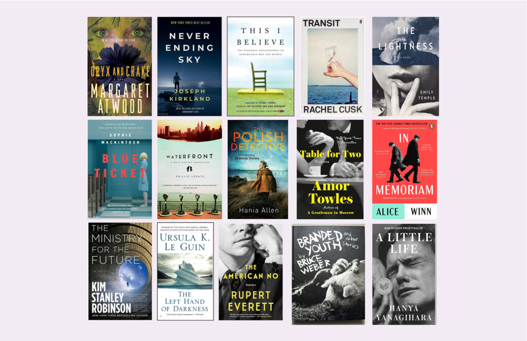
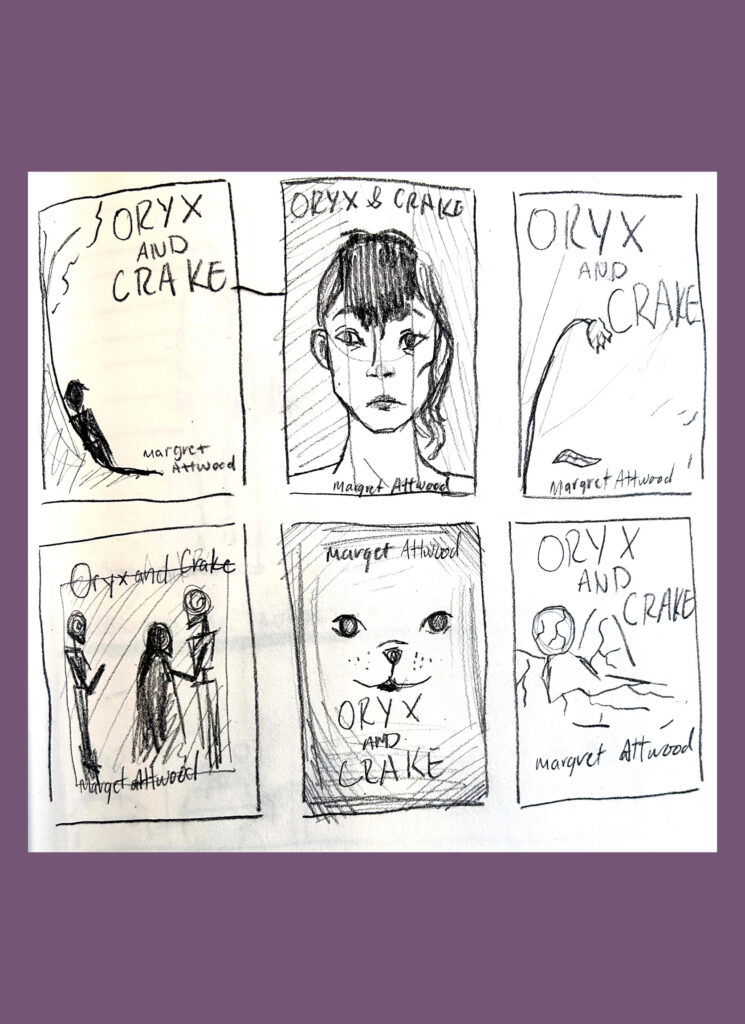
Oryx and Crake

This book cover was designed with a more serious approach in mind. I wanted to experiment with designing a book cover that incorporates photography instead of relying on illustration. When choosing the subject for this cover, I wanted the photograph to be representative of the dystopian genre of the story. In the end, I chose to photograph a broken statue that represented how the world in the story was dying. I also felt that this statue represented the love interest and her fate in the novel.
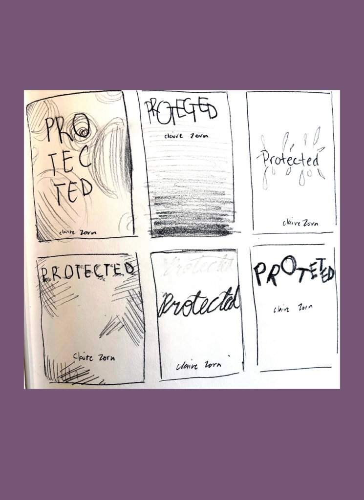
Protected

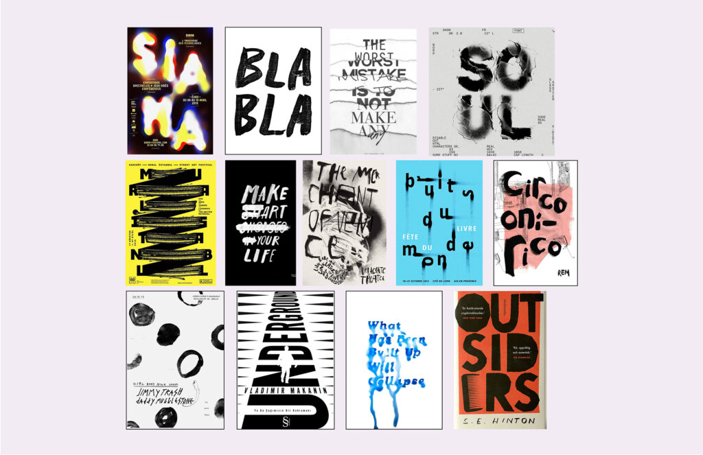
This book cover was designed to represent the book better than the original cover does. When designing this cover, I experimented with a typography-centred cover that featured an original handwritten font. I wanted to work on a more typography-focused design that also expressed the themes of the novel better than the original had. The story features a protagonist struggling after the passing of her sister and the difficulties of feeling isolated and alone at school. I wanted to portray this through the book cover and came up with the idea to use watercolour to express her emotions throughout most of the book. This is why I chose to use a pen to define the words with trembling lines, representing how the protagonist feels shaken and unsteady. The blue watercolour splatters and drips are meant to be reminiscent of tears, and the blue colour also represents sadness, further emphasizing it.
To Kill a Mockingbird

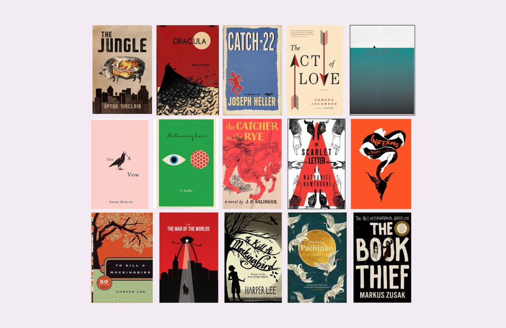
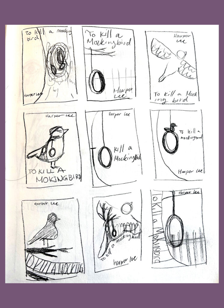
This book cover was inspired by classical novels’ more modern book covers and how they are created to represent the events and theme of the book. This design features the mockingbird perched on a tree, and in the novel, it represents innocence and harmlessness. The tree illustrated on the cover has an important role in the story; the hole is where the protagonist finds gifts left by someone who is perceived to be a monster, despite being very kind. This theme of how people are perceived by society is a common theme in the novel. The tire swing illustrated on the tree is representative of the protagonist playing on it with her friend and brother.
Winnie the Pooh

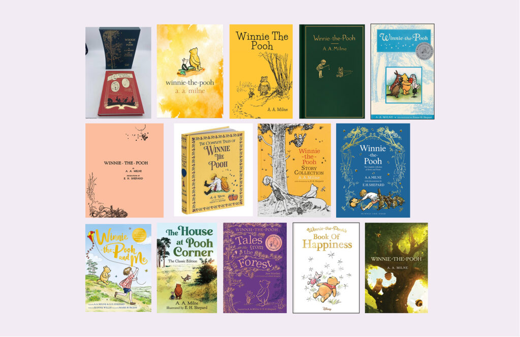
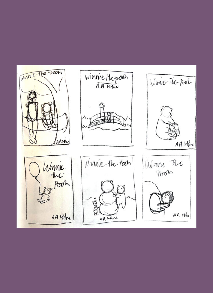
This book cover was inspired by the older book designs before the animated series came out. It is illustrated similarly to how the original illustrator drew the characters and scenery. When designing this book cover, I wanted to try something that looks visually different and work with a different style in mind. This design, while inspired by the original illustrator, features an original illustration that I created.
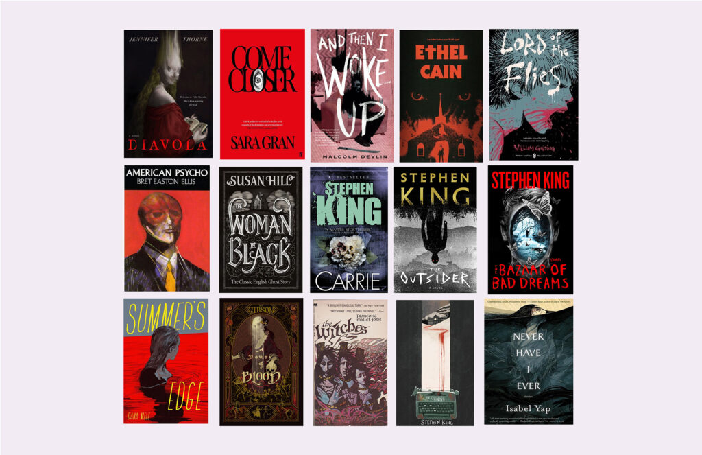
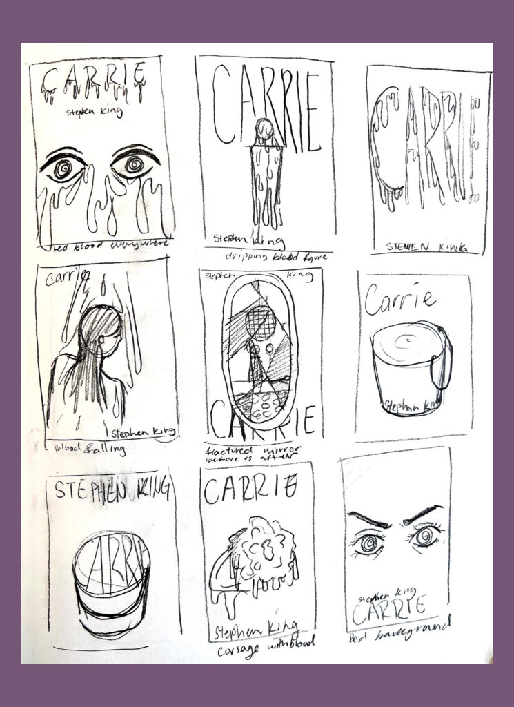
Carrie

This book cover is designed to be more modern and represent the horror genre more than the original cover does. The illustration on this book cover features a shattered mirror with the before and after the protagonist reaches her breaking point. The after is further emphasized by the red blood stains and the red overlay, which symbolizes the overwhelming rage the protagonist experiences. The white ornate mirror is illustrated to represent the perception of purity that the protagonist’s mother instills in her; this is something that is a main theme in this novel.